Read Design Window Fashions - blinds, shutters, shades, curtains in Dallas - Fort Worth

Contact Us

How can we help you?

Southlake Hunter Douglas Gallery  
2757 E Southlake Blvd. Suite 100
Southlake, Texas 76092

Plano Hunter Douglas Gallery  
4021 Preston Rd. Suite 622
Plano, Texas 75093

Visit our Hunter Douglas website for more information.

If you have a question about our products or service, or if you would like to receive a free estimate, please contact us by phone at 972-608-4999 for Plano or 817.416.7164 for Southlake or fill out the form to the right.


4021 Preston Rd
Plano, TX, 75093
United States

9726084999

blinds, shutters, shades, curtains, interior design, furniture, accessories

IMG_1649.JPG

Blog - Window Treatments, Design & More | Read Design

Browse the Read Design blog for interesting reads, helpful tips and the latest trends for interior design, home accents, window treatments and more.


Filtering by Tag: color

Fresh Ideas For Your Home - Leather

Read Design

IMG_2015.JPG

Make a decorating statement with leather furnishings.

This bold design move shows you have skin in the game.

Consider a touch of leather in your next decorating project. It will be a moo-ving experience that’s sure to enhance your home environment! And most leather design elements are practical too!

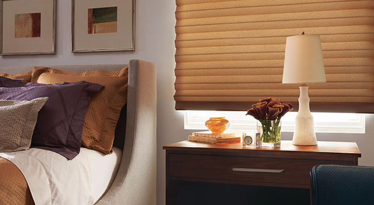
Leather adds great texture, softness and color; however, beware that it can be a heavy look, especially in its most typical design colors – dark brown and black. That’s why it’s best to soften a big leather piece of furniture with other elements such as creamy paint colors, cushy throws and pillows, silky rugs and soft fabric furniture and window fashions.

Another way to lessen the heaviness of leather design elements is to select a lighter color of leather, such as beige, white, gray or sage green. Or you can add a tidbit of brightness with green, red or yellow leather!

Complementary materials and textures can also lighten up a heavy leather look. Think:

  • Glass or Lucite tables

  • Metal chairs and lamps

  • Light filtering, soft-looking window fashions

  • Bamboo flooring

  • Natural grass wallcoverings

IMG_2014.JPG

Leather is a versatile choice that adds beauty to most any decorating style from a traditional dining room to a classic living room to an ultra-contemporary great room. Think about leather for these design elements:

  • Leather sofas and easy chairs, and even recliners!

  • Leather dining chairs

  • Leather headboard

  • Leather-fronted sideboard in the dining room or dresser in the bedroom

  • Leather-covered walls in a powder room or home office

Add leather to your next design project and you'll be ahead of the herd!

Fresh Ideas For Your Home - Complementary Colors

Read Design

Complementary colors beautifully finish almost any design plan

IMG_1434.JPG

Use them for harmony and a sense of calm.

The old adage that opposites attract is often true; and especially in selecting the colors for decorating your home. Using opposite colors (also known as complementary colors) adds energy to a room, yet at the same time, makes us feel comfortable and complete.

Complementary colors are the shades that are opposite on a color wheel:

  • Red and green

  • Orange and blue

  • Purple and yellow

IMG_1435.JPG

Nature is full of complementary colors, such as dramatic red roses on stems with bright green leaves, delicate pansies with their purple and yellow color combination, and bright blue sky and sea positioned near golden sand.

For a more modern take on complementary colors, you can use shades that are not exactly across the color wheel, or you can be a bit creative with the complementary color concept. Think about innovative hues like:

  • Sky blue and terra cotta

  • Pink grapefruit and acid green

  • Burnt orange and sage green

  • Soft aqua blue and tomato red

If you feel cautious about adding complementary colors, start small with elements like a painted wall, sofa pillows, throws, flower arrangements or slip covers. Then, as you become more confident, you can ratchet up your color scheme with larger and more permanent items like upholstery fabrics and window fashions.

Balance your interior design plans beautifully by selecting complementary colors.

Fresh Ideas For Your Home - Copper

Read Design

A touch of copper will burnish your interior home space.

Copper is more than just a metal; it's a rich color for home design.

Usually when we think about a metallic finish to add to our homes, we consider gold, silver or bronze. Copper is a welcome change and provides a surprising, unique look. While silver is a cool metallic color, copper (like gold and bronze) is a warm color that provides richness and creates an inviting mood. 

Even within the color called copper, there are many variations. In general, copper is a cross between rich orange or gold and deep pink. Copper can range from a light honey pink tone to a dark ochre hue. Metallic copper can be finished in several ways – from bright and shiny looks to oxidized and rough surfaces. Copper is versatile too; it works well with the most modern of design styles in addition to complementing rustic looks and traditional design plans. 

Copper looks fabulous with almost any neutral. It’s especially effective paired with blues, greens, brilliant jewel tones and silver gray. And copper is not just a product made from metal; copper is also a color that can be used in upholstery fabric, window fashions, and bed and table linens. 

Think of these design elements to add in a copper tone:

  • In the kitchen – stove, hood, countertops, faucets, backsplash, appliances, tiles 
  • In the bathroom – faucets, backsplash tiles, bathtub, sinks

  • In the dining room – chandeliers, flatware, wallcoverings

  • In the living room – lamps, coffee table tops and end table tops, pots for indoor plants

  • And in most any room – paint, upholstery fabrics, window fashions and accessories

Add the lushness of glowing copper to your decor this year. It will add unique style and create a warm mood.

Fresh Ideas For Your Home - Simple Style

Read Design

A clean and simple design style can make your life less stressful. 

The look of your home can give you peace of mind and a sense of calm. Many of us have feelings of stress because we’re overwhelmed by the demands in our lives. What better goal to consider in your home decorating plans than to create a home environment that’s calming and relaxing, both on the eyes and on the soul. 

Simple doesn’t mean plain or unattractive. Simple design can create a sophisticated, traditional, elegant look or a modern, minimalist feel. The bottom line is reducing chaos and over-decoration, and minimizing clutter and confusion.

  • Plan only one or two focal points per room, so you can really “see” the beauty, rather than having a hodge podge of color and design elements. 

  • Limit the number of colors in your design and stick with gentle colors, rather than bold primary colors. 

  • Make color transitions gentle. Avoid making too strong a statement between dark and light colors, such as black and white. (However, keep in mind that you may want energizing colors in a room; for example, in a kitchen or home office where you’d like to be engaged and active.)

Once you’ve created a simple, clean design, enjoy it! Allow yourself relaxing time to read a book or watch your favorite TV show, without answering the phone or responding to text messages. Spend time with your family or friends in a quiet way, without over planning your activities. 

Achieving a calm and simple home environment can help you find peace of mind every day. 

Pantone Color Of The Year 2017

Read Design

Introducing Greenery!

A refreshing and revitalizing shade, Greenery is symbolic of new beginnings. 

Greenery is a fresh and zesty yellow-green shade that evokes the first days of spring when nature’s greens revive, restore and renew. Illustrative of flourishing foliage and the lushness of the great outdoors, the fortifying attributes of Greenery signals consumers to take a deep breath, oxygenate and reinvigorate.

Greenery is nature’s neutral. The more submerged people are in modern life, the greater their innate craving to immerse themselves in the physical beauty and inherent unity of the natural world. This shift is reflected by the proliferation of all things expressive of Greenery in daily lives through urban planning, architecture, lifestyle and design choices globally. A constant on the periphery, Greenery is now being pulled to the forefront - it is an omnipresent hue around the world.

A life-affirming shade, Greenery is also emblematic of the pursuit of personal passions and vitality.

What is the PANTONE Color of the Year?

A symbolic color selection; a color snapshot of what we see taking place in our global culture that serves as an expression of a mood and an attitude. 

Nature’s neutral, PANTONE Greenery is a versatile “trans-seasonal” shade that lends itself to many color combinations. As displayed in the 10 palettes below, Greenery is paired with neutrals, brights, deeper shades, pastels, metallics and even the enduring presence of PANTONE Color of the Year 2016, Rose Quartz and Serenity. These palettes easily cross over fashion, beauty, product and graphic design applications.

To find custom window treatments, wallpaper, pillows and more in this bright, energetic color call Read Design in Plano or in Southlake today! We service all of Dallas - Fort Worth including Richardson, Garland, Murphy, Sachse, Allen, Wylie, St. Paul, Rockwall, Rowlette, Plano, McKinney, Frisco, Prosper, Little Elm, Celina, Gunter, The Colony, Lewisville, Coppell, Carrollton, Farmers Branch, Colleyville, Trophy Club, Southlake, Westlake, Flower Mound, Roanoke, Keller and everywhere in between. 

Blog by Pantone

Fresh Ideas For Your Home - Pantone Colors 2016

Read Design

Rose Quartz and Serenity are the colors of the year, according to the Pantone Color Institute.

Try using these calming shades of pink and blue in your interior plan.

The Pantone Color Institute has selected two shades – Rose Quartz and Serenity – as their colors of the year for interiors. Each year, Pantone selects a color that expresses a mood and an attitude for the year; and this is the first time the organization has selected two shades as color of the year!

These soft shades of calm blue and serene pink make us feel more secure and at peace. When used in home décor, they add to our sense of well-being, helping take away the daily stresses of life in our own home environments. 

Joined together, Rose Quartz and Serenity demonstrate an inherent balance between a warmer embracing rose tone and the cooler tranquil blue, reflecting connection and wellness as well as a soothing sense of order and peace.
— Leatrice Eiseman

Leatrice Eiseman is the Executive Director, Pantone Color Institute®. "Rose Quartz is a persuasive yet gentle tone that conveys compassion and sense of composure, while Serenity is weightless and airy, like the expanse of the blue sky above us, bringing feelings of respite and relaxation even in turbulent times.” 

Whether you use each color alone or use them together in your home environment, this year think Rose Quartz and Serenity for upholstery and drapery fabrics, rugs and carpeting, paint, tile and backsplashes, bed and table linens, and accessories. 

Soften your home environment this year by decorating in Rose Quartz and Serenity.

Fresh Ideas For Your Home - Taupe

Read Design

Think taupe for a more sophisticated shade of neutral. Taupe is an unusual color that's hard to describe.

The color taupe is a soft, sensuous shade, but what exactly is it? It’s almost easier to say what it’s not.

It’s not cream. It’s not beige. It’s not white, and it’s not gray. It’s a neutral with tints somewhere between brown and gray, and it’s usually a little bit darker than other neutrals. Some people compare it to the color of a delicious mushroom bisque. And like different batches of mushroom soup, taupe can come in darker and lighter hues.

Taupe is a chic, sophisticated neutral that goes with almost any style of interior design.
Most all shades of taupe go well with:

  • Greens, such as khaki and olive
  • Black
  • Other neutrals, such as white and cream
  • Chocolate brown
  • Gold

Some taupes have a pink or lavender undertone, and these shades go well with dark pinks and violets, such as burgundy and raspberry. Other versions of taupe have a cooler tone; and these go well with dark blues, aquas and teals. It’s smart to compare your taupe design elements with proposed purchases before you buy to make sure the colors complement each other.

Think taupe for wall paint or an accent wall, window coverings, upholstery fabric, flooring, bed linens and more.

Consider the neutral taupe for a terrific addition to your interior look.


Providing Services to all of these areas: Dallas, North Dallas, Plano, Carrollton, Farmers Branch, Addison, Coppell, Southlake, Denton, Keller, Roanoke, Benbrook,  Westlake, Fort Worth, Lewisville, Grapevine, Trophy Club, The Colony, Frisco, Prosper, Celina, Savannah, Aubrey, McKinney, Allen, St. Paul, Wylie, Sachse, Rockwall, Rowlett, Lucas, Parker, Melissa, Anna, Fairview, Heath, Garland, Richardson, Irving, Las Colinas, University Park, Highland Park, Kessler Park, Euless, North Richland Hills, Colleyville, Flower Mound, Corinth, Arlington, Little Elm, Hurst, Saginaw, Haltom City, Bedford, Watauga, Haslet and many more!

Client Work: Custom Bedding & Interior Design - Dallas, TX

Read Design

Lori-Custom-Bedding-4-e1368566718638-300x225.jpg

Lori lives in a high-rise condo in up town Dallas TX

Lori wanted her bedroom to be a retreat. What I learned about her is that she loves chocolate browns and pillows, and lots of them! We started with a rich color scheme of brown and a soothing blue green. The walls were painted a soft spa blue from Benjamin Moore.  We had an upholstered velvet headboard added to her poster bed. And then layered on the pillows using fabrics in velvets, silk, and a rich tapestry.  On the window we used a 4″ Silhouette from Hunter Douglas. Beautiful!


Providing Services to all of these areas: Dallas, North Dallas, Plano, Carrollton, Farmers Branch, Addison, Coppell, Southlake, Denton, Keller, Roanoke, Benbrook,  Westlake, Fort Worth, Lewisville, Grapevine, Trophy Club, The Colony, Frisco, Prosper, Celina, Savannah, Aubrey, McKinney, Allen, St. Paul, Wylie, Sachse, Rockwall, Rowlett, Lucas, Parker, Melissa, Anna, Fairview, Heath, Garland, Richardson, Irving, Las Colinas, University Park, Highland Park, Kessler Park, Euless, North Richland Hills, Colleyville, Flower Mound, Corinth, Arlington, Little Elm, Hurst, Saginaw, Haltom City, Bedford, Watauga, Haslet and many more!